
Microsoft has published two images showing a modified view of the Start menu. The tiles of the start menu no longer have different colors, but adapt to the light theme.
Microsoft published on Facebook through its Office 365 account the new images of it’s redesigned sleeker Windows 10 Start Menu. The company did not mention anything about the new menu design.
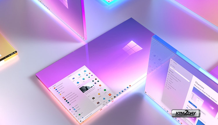
The images show Windows with a Phantom Pink Pride Edition theme in combination with light mode and transparency enabled.
The difference with the current Windows 10 start menu is that the Live Tiles no longer have colors, but are white with the icon of the corresponding apps. In addition, the list of all apps next to the tiles shows only the icon next to the name of the apps. These icons no longer have a background color and are not placed in a white plane, but are surrounded by the semi-transparent view of the start menu.

This new UI makeover is intended to take the colourful tile and make it “uniform,” both in light and dark modes.
This isn’t the first time Microsoft has shown this simplified view of the Start menu. Microsoft previously gave some teasers. The question is whether Microsoft will make the view widely available and release it in the next version. The upcoming major update of Windows 10, 20H2 due in the fall, and contains virtually exclusive performance and stability improvements.


")


")

