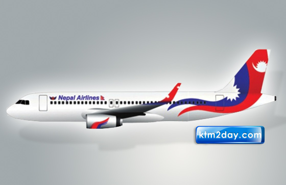
Nepal Airlines new livery design to reflect national identity

Nepal Airlines Corporation (NAC) has finalised its new livery, which will be used in its new aircraft in the coming days.
It had announced an open design competition a month ago, and on December 4, it announced the winner and made public the livery that will be used in its new aircraft.
The corporation has selected a design prepared by Bishwas Pokharel, which will be used as the new livery. The old livery will be gradually replaced, states the NAC release. A total of 62 designs were submitted by 31 artists, among which, Pokharel’s design was selected by a five-member expert team of Lalit Bikram Shah, Madan Chitrakar, Swasti Rajbhandari, Nabin Joshi and Ganesh Bahadur Chand.
The new design reflects the national identity of Nepal. According to the corporation, the wave in the design consists of three basic elements. NAC’s name is placed in the body with a larger font face so that it looks strikingly elegant and bold. With the significant emblem of the Nepali flag beside it and with an elegant font-face the name stands out in the body and signifies the simplicity and elegance of the Nepali airlines, NAC said.
The colours that have been used in the wave are the brand colours of Nepal Airlines Corporation. The shape of the wave is so designed that it resembles NAC in every way. The two prominent structures of the sun and the moon signify that the airlines flies through day and night.
According to NAC, the bird was integrated to the design keeping in mind that the concept of flying was developed after watching birds fly; birds do have a significant importance in airlines. Hence, two red and blue birds have been integrated into the design. It is tilted in such a way that it mimics the posture of the aircraft while taking off, landing or flying.
Meanwhile, the Aakash Bhairav symbol is derived from its precedent symbol in the airlines, as this symbol marks a great importance in the Nepali aviation sector.


